Coffeezilla Case Study
2022
Coffeezilla
Role: Designer
Deliverables:
Brand Identity
Packaging Design
Socials Post
Poster’s
In a product-focused market with so many competing brands and company’s the objective was to create a logo and branding for the fictional establishment: Coffeezilla. Coffeezilla is a start-up coffee shop based in Toronto, Canada, the challenge was to create branding that would stand out from the competition and on the shelves. The brand combines two very different things in one- Humans and monsters.
by using these factors, the brand's approach is focused more on personality and benefits that by using this product it will further empower consumers. The brand's visual identity draws inspiration from Godzilla and other such monsters with each product being named after a word you would describe such a creature ( Behemoth, Colossal, or Goliath)
My Creative Process
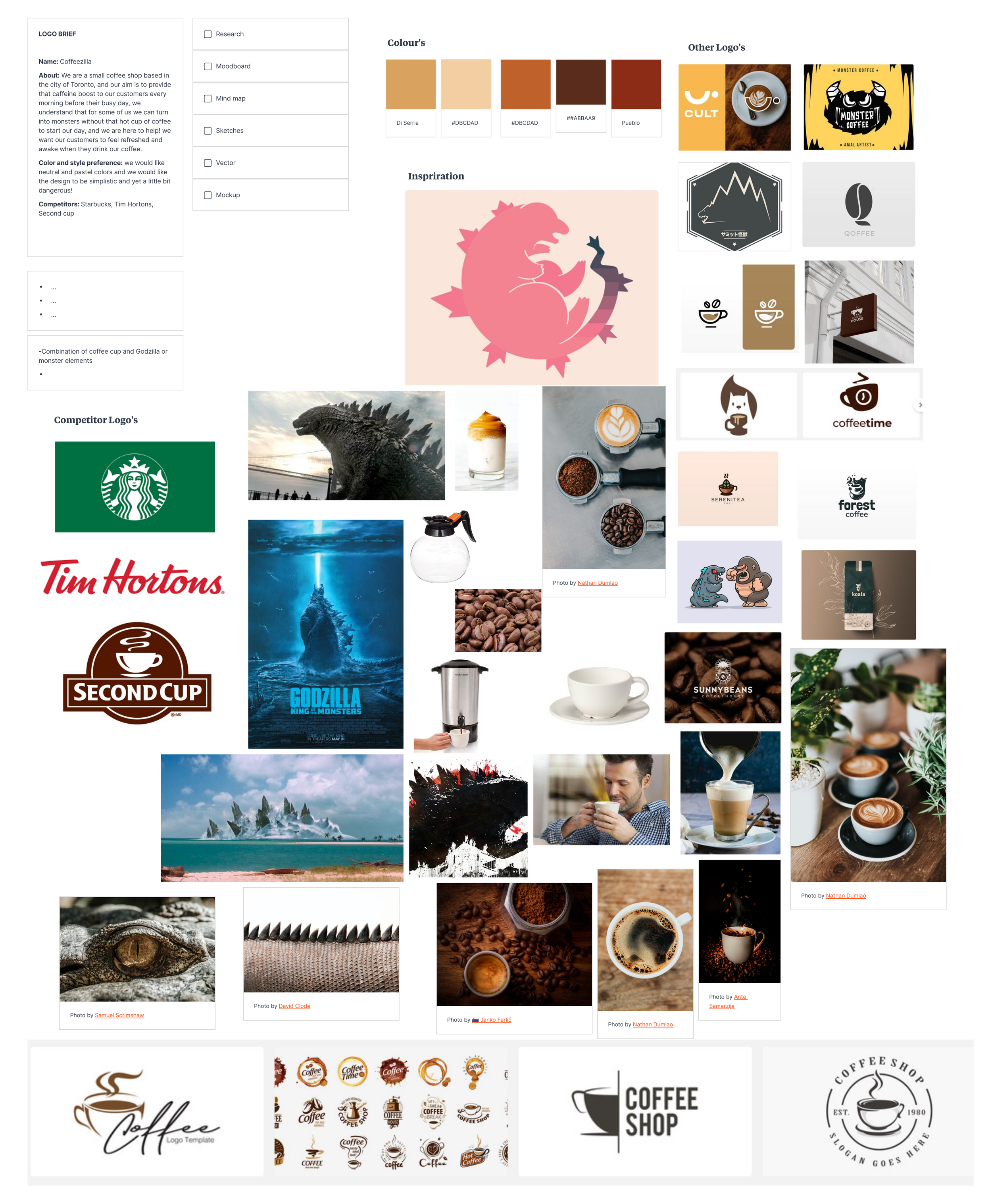
The first thing I did when taking on the challenge of creating this logo and branding was; make a mood board. I did some research into competitor brands and coffee shops as well as finding images I could gather inspiration from such as images of Godzilla, monsters or just images of coffee.
After collecting all these images in one place for reference I started looking into a colour pallet, I went to adobe colors and searched for colours I thought would work well with the idea I had for my design, I wanted to use warm colors, colours you find in images with coffee.
When I had the colours I wanted to use I started brainstorming by doing a word map, by using words such as the company name, I then came up with similar words I could associate with the company name to give me ideas on the direction I could go with the logo and branding.
I then started sketching some ideas down based on the words I came up with during my brainstorming process, after about a dozen or so I knew I wanted to do a design with a Godzilla-like creature coming out of a coffee cup or mug, I was thinking maybe latte art or foam could make the shape of a head coming out of the coffee.. but after asking for a second opinion from others, we agreed that none of the designs looked very memorable .. so I went back to sketching.
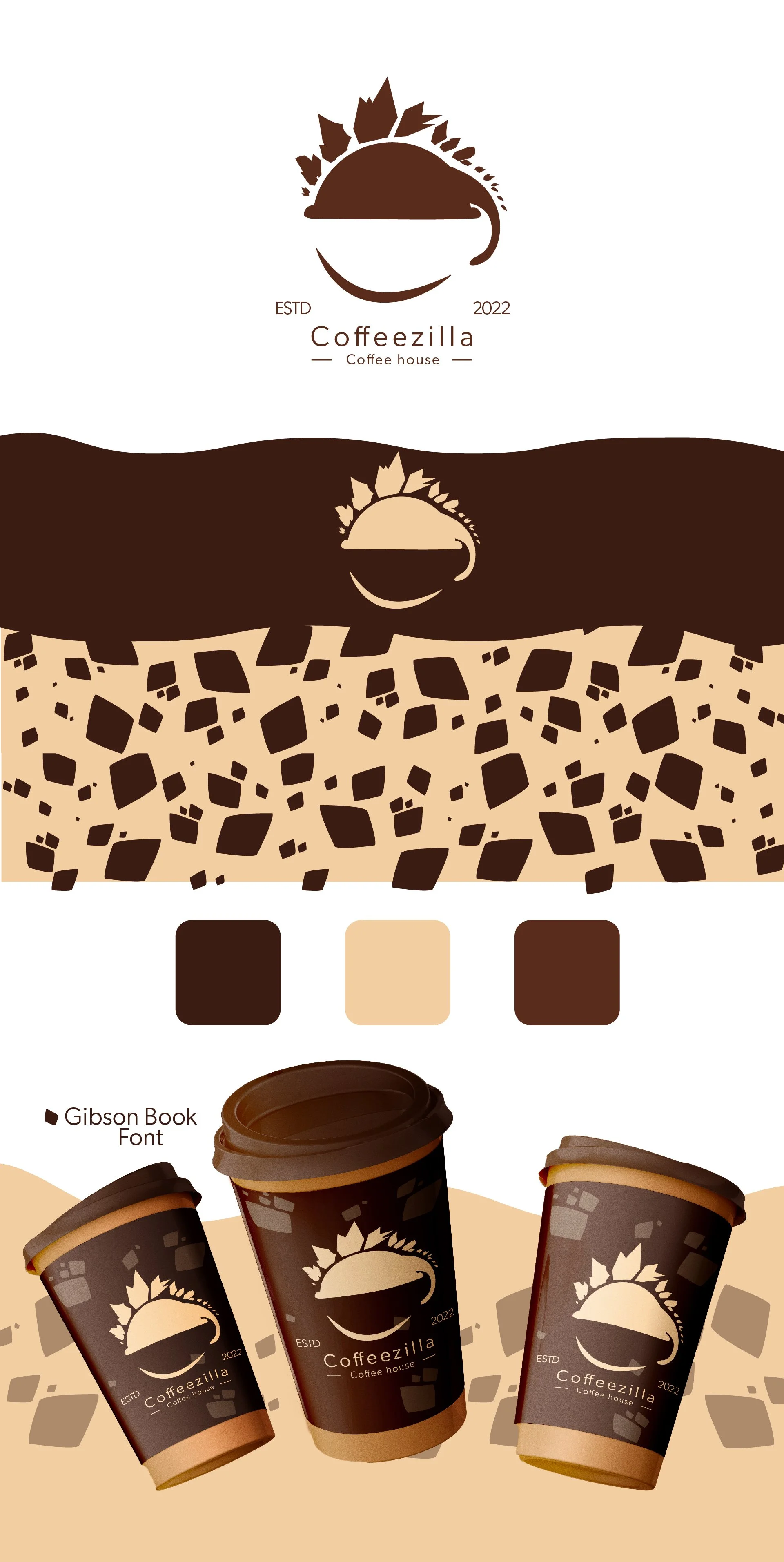
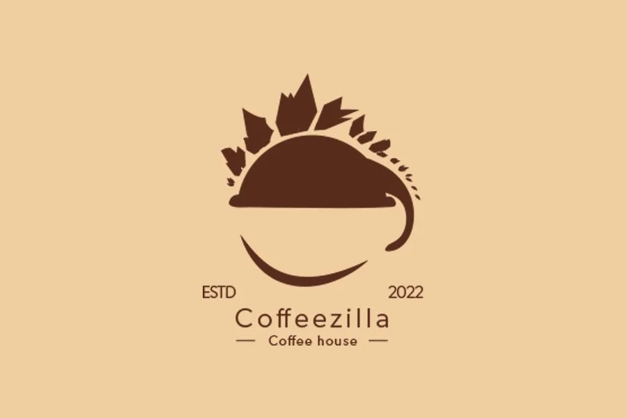
Finally, I arrived at the design I would end up using which was still Godzilla coming out of a coffee cup however not a head, but the spines which is inspired from the scenes in Godzilla movies when you first see Godzilla.
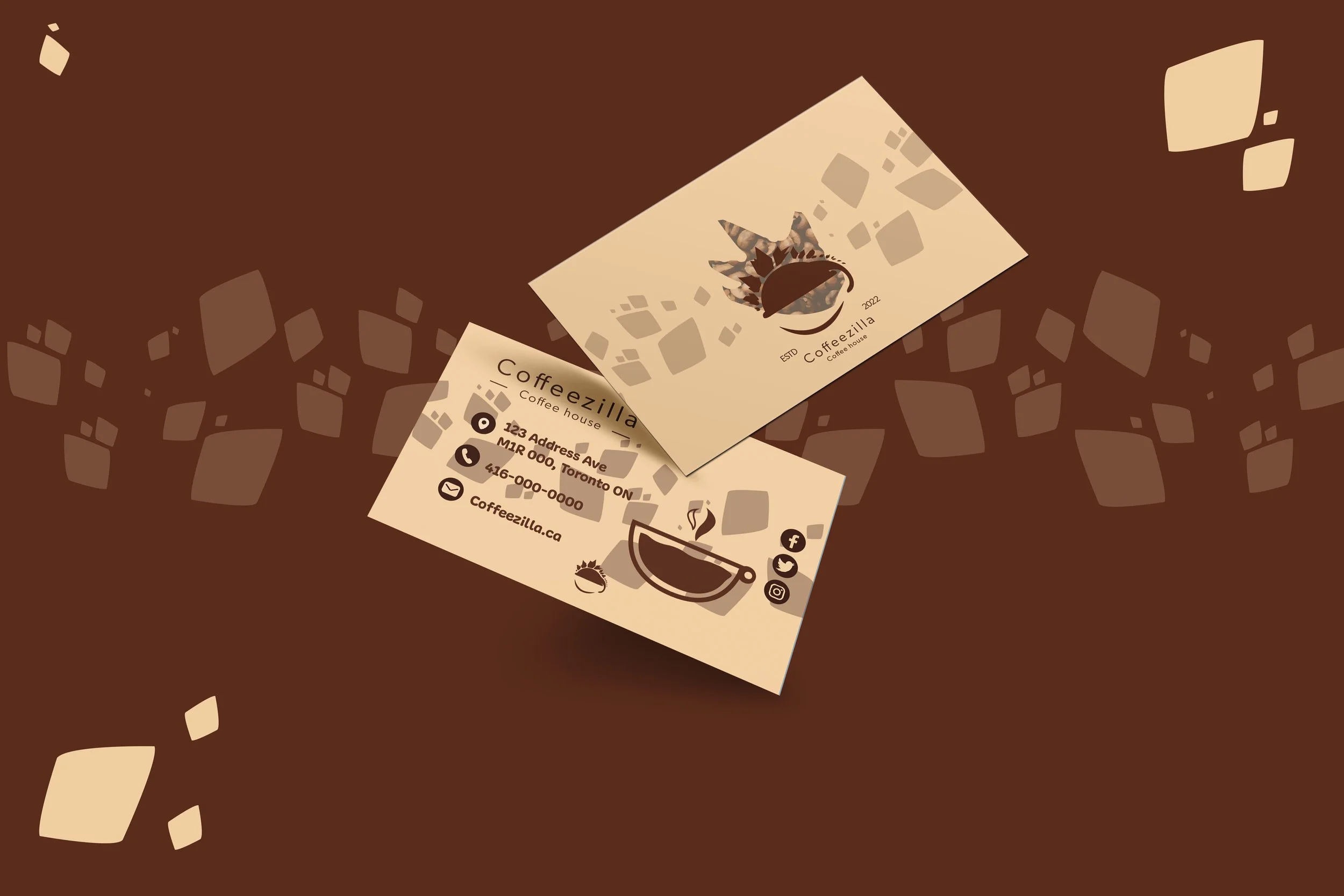
After finalizing the design of my logo I then started looking into fonts on adobe fonts that would pair well with my logo design, the design itself looks bold and bulky so I wanted some contrast between the two and decided to pair it with a thin light font called Gibson Book, I then altered the kerning of the font a little to add some space in between the letters, when I was happy with the look I then took my sketches into illustrator and created a vector version of it, I then designed the branding design/pattern that would appear on the packaging which is Godzilla’s scales. Having all that done I then created mock-up images of the logo and branding which can be seen in action below!
